24me smart personal assistant

App store previews and graphic design
In summer 2021, I had the opportunity to travel to Israel for 2 months for my internship with 24me, an app start-up. 24me is an award-winning Personal Assistant that helps millions of people all over the world to boost their productivity. It puts everything related to your schedule in one place including your CALENDAR, TO-DO LIST, NOTES and Personal Accounts.
During this turbulent summer, I was actually able to go into the office and work directly with the founders of the company. My role was a creative and design intern, the only designer in the office. I helped to execute their vision for new previews for the App Store, where my final version currently can be viewed. I also was able to create app icon redesigns for both of the company’s apps, 24me and GroupCal.
Location: Tel Aviv, Israel
Duration: 8 weeks
Role: Creative and Design Intern
Design Process
-
Research
The first thing I had to do was gain an understanding for what the purpose of the App Store Previews. I also had to understand the app 24me in order to identify the best features of the app to highlight for potential new users.
-
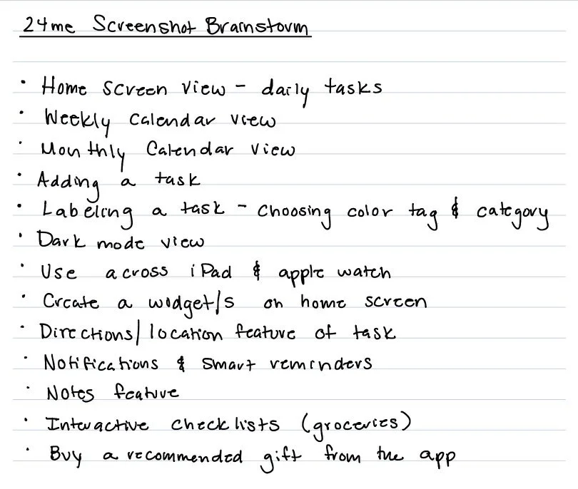
Brainstorm
The next step was to invent creative ways to improve the screenshots featured. I gathered inspiration from other major apps and thought of ways to apply my ideas to 24me. This process involved having many conversations with the app’s founders to establish their image for the project.
-
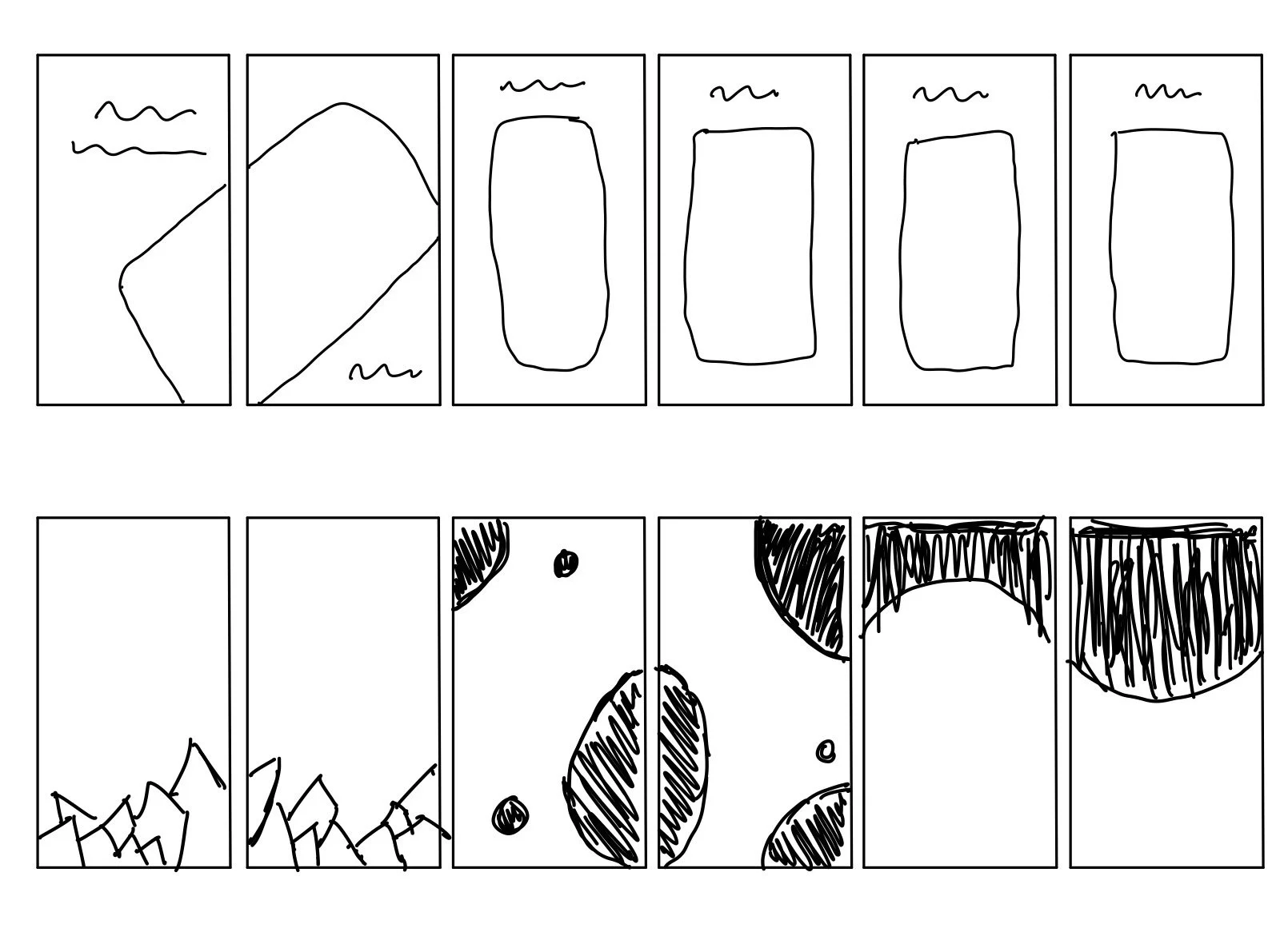
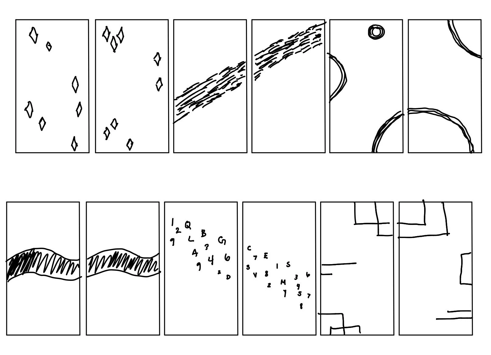
Sketch
After having the time to collect my ideas, I put them to paper creating a variety of sketches with different backgrounds and iPhone layouts. Picking a few of my favorites, I went to InDesign and Photoshop to make my first rough mock-ups of the screenshots.
-
Feedback
Although it was important for me to check in over the previous steps with my clients, after creating the sketches, we needed to discuss the path we wanted to continue designing for. Having these conversations and determining the path to create a final mock-up for was instrumental in this step.
-
Final Version
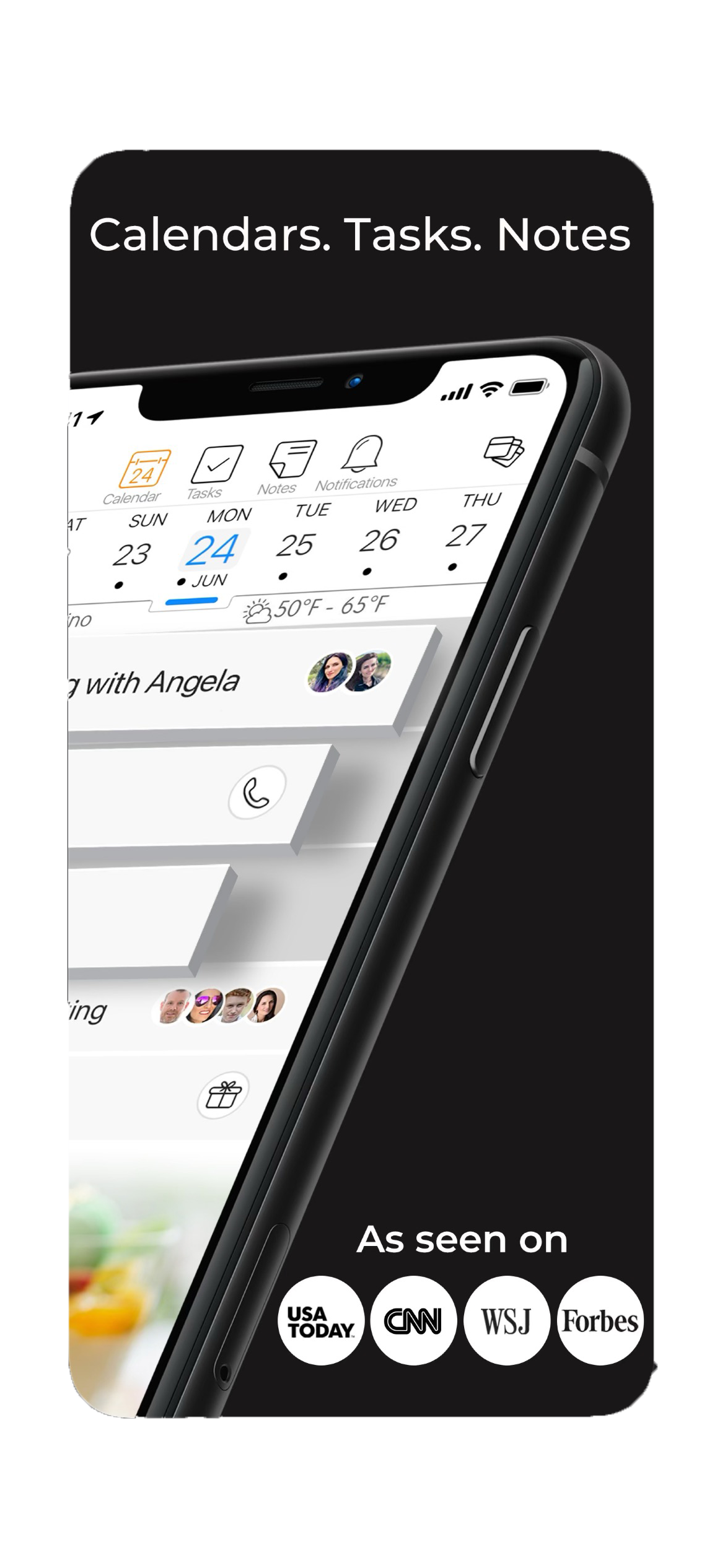
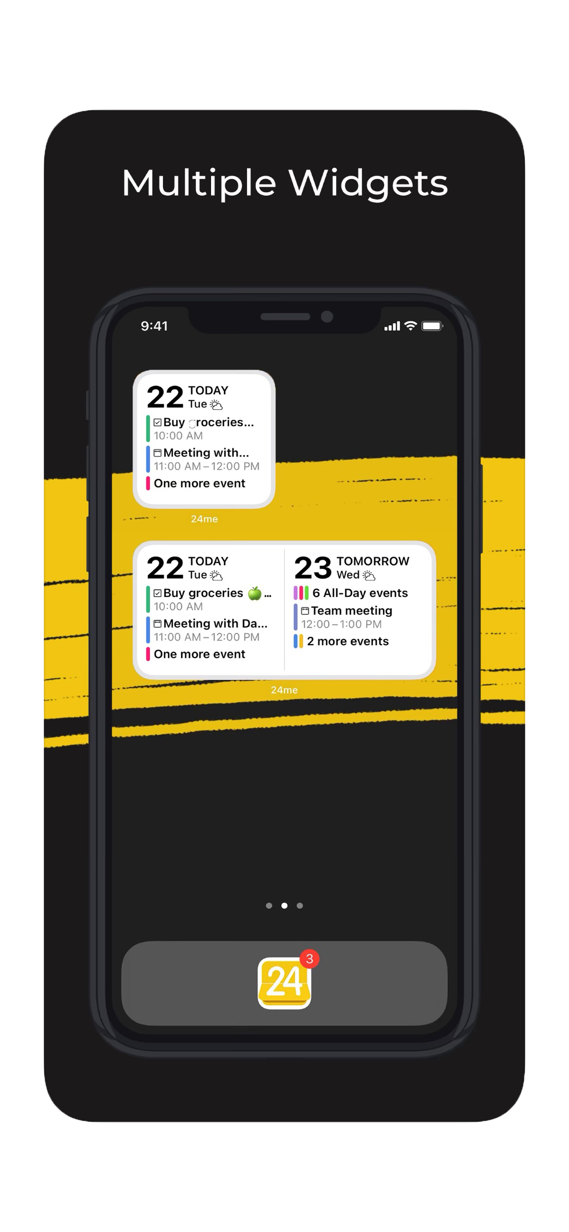
Using Photoshop, I created the final version of screenshots, now available in the App Store. I created each image to show specific features of the app and designed the larger image to prominently display these. Overall, I achieved my goal of producing this final product to entice potential users.
Identifying issues with the previous App Store Previews
Did not utilize the 10 screens Apple offers optimally, only using 4 screens
Not dynamic or visually appealing, dated design and contained versions of older iPhones
Didn’t exemplify the unique features of the app to potential users
Not available in all of the languages the app is offered in
Our goals for the project
Create new App Store previews for screen size 6.6 inch, 5.5 inch, and iPad
Brainstorm and design new app icons for future use and updates
Inspiration 💭
My inspiration for this project came from flowing abstract designs and connectivity. Many apps that exist in the App Store have designed beautiful graphics to feature their screenshots, knowing the value users put on first impressions. These are a few apps I took my personal inspiration from.
Notifications popping out of the screen, great representation of dark mode
Simple but impactful headlines for each screenshot
Bold abstract backgrounds and soft slowing shapes in neutral colors
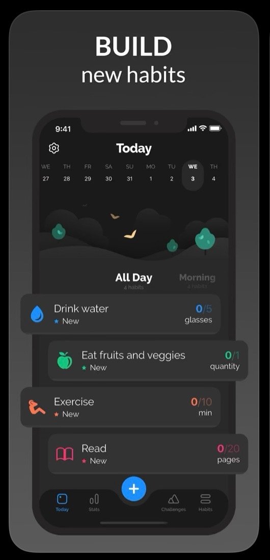
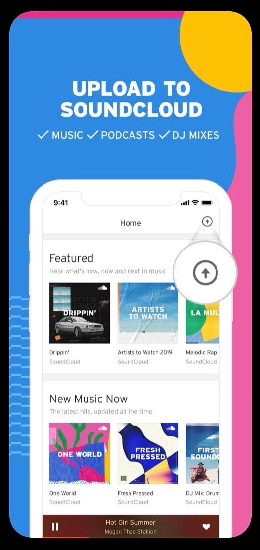
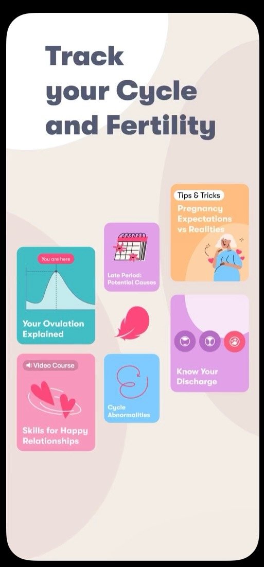
Rough sketches
My Rough Mock-ups:
Sketched in Indesign, I played with a variety of abstract backgrounds, different themes (darks vs. white), and multiple phone layouts and styles.
I had so much fun freely designing whatever I wanted in this stage of the process. After this, I would seek feedback from my bosses!
These are just a select few of many many many…
Creating the screenshots
Photoshop was my best friend in this process. The actual screenshots from the app need more than just to be taken and placed in the graphic. I had to methodically plan out every screen before I snapped a pic and then put it in Photoshop to simplify and perfect. This was a way longer part of the process than I ever anticipated but it made me work on my own usability design and think about how to best represent the app to users.
Final result & change in direction
After getting feedback from my bosses on the mock-ups, we decided to go with the dark theme and use real iPhones for the 6.5 inch screen size and just screens for the 5.5 inch screen size. They liked the abstract element and specifically wanted to incorporate this yellow paint stroke in the design. We also decided that a 3D element on the first two screens would draw in users. Below is the final result currently in the App Store!





App Icon Redesigns
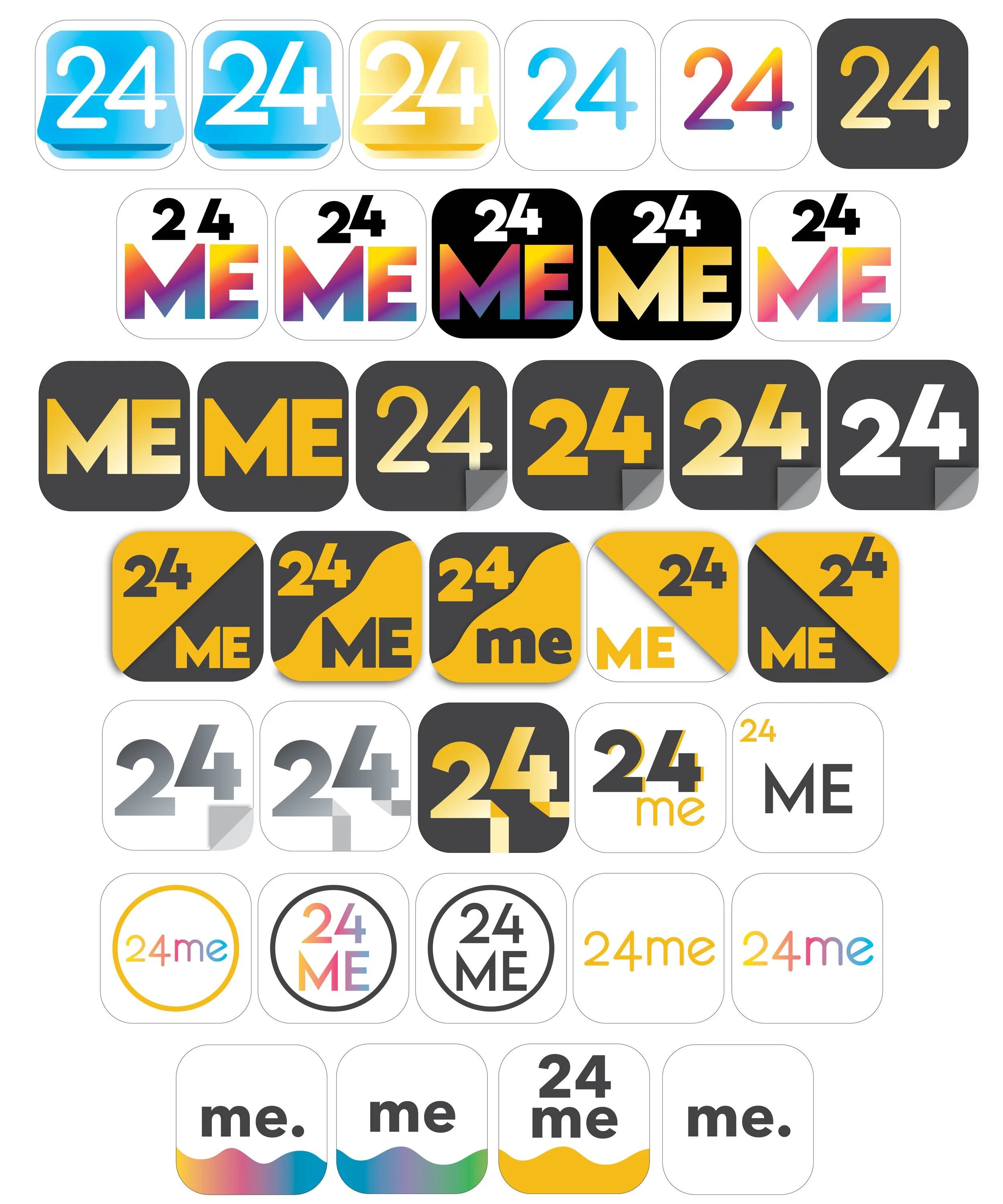
24me
For this app I had the freedom to design anything I wanted for the new app icons. The founders wanted options to keep around for a rebranding in the future. Below are the sketches that I created for them.
GroupCal
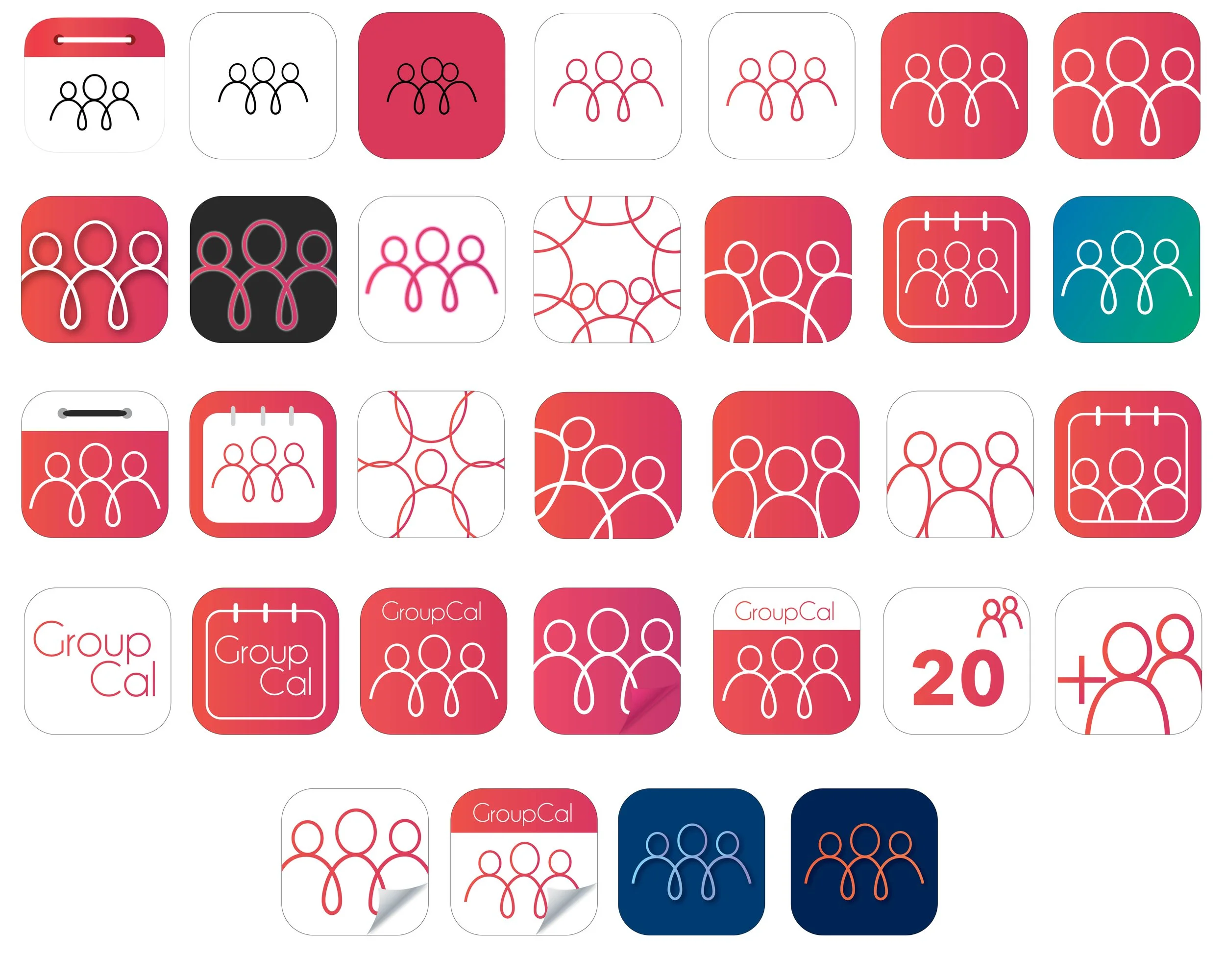
The second app that 24me owns is GroupCal. They also wanted redesign options for this app. I chose to stay more with the same theme they had created and made different variations. Below are my final sketches that I designed for them.
Reflection and Final Thoughts
Having the opportunity to have my work matter so much to a company was the most rewarding feeling. Although my design skills have improved since the creation of this project, I am proud to say my work is featured in the App Store for a prominent and helpful app. Working in a different country taught me a lot about the importance of communication and clarification with my bosses and clients. I am proud of the work that I was able to create and how I could present this app to the world.
